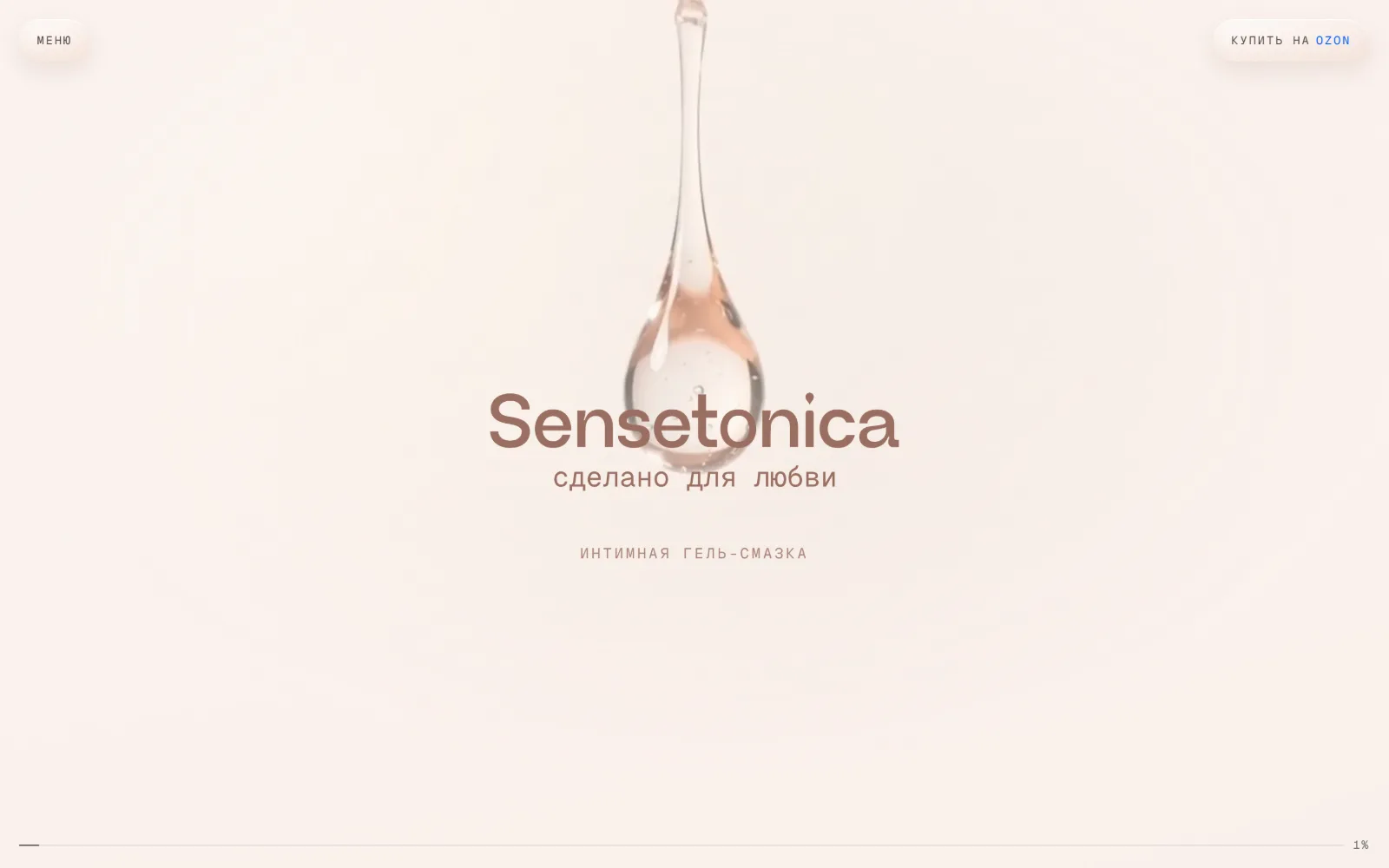
Brand website that sells through a marketplace
Sensetonica
Context
Sensetonica is a Russian brand of water-based intimate gel lubricant. The range holds one volume and two variants: unscented and aloe vera. Sales run through a marketplace, so the site is not a shop — it has one job, which is to carry someone who has nearly decided through to the product listing.
Challenge
The category is delicate, and the conversation is easy to spoil with either coyness or bravado. What it needed was a calm tone, an honest formula in plain sight and a single path that ends in a purchase rather than a form.
One Scene Instead of a Page of Sections
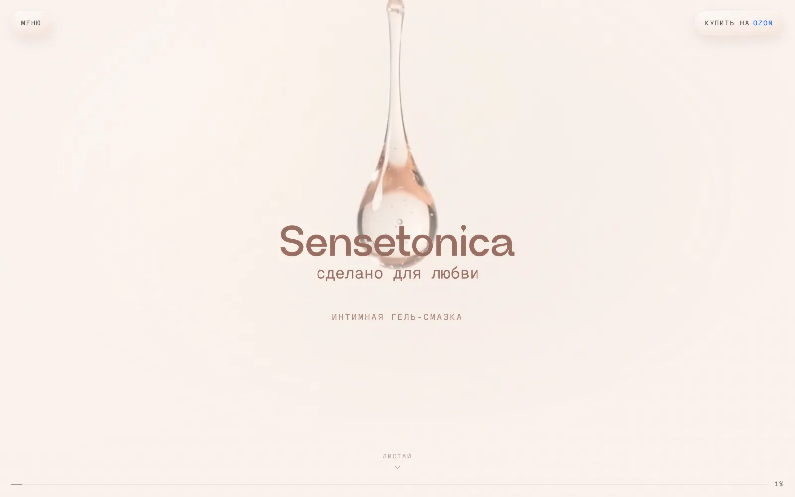
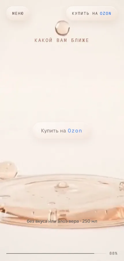
The whole site is a single frame that changes as you scroll. Video is tied to the page position, and each layer of text lives on its own stretch, arriving and leaving with it. A progress indicator at the bottom shows how much of the story has passed, in place of a scrollbar's usual sense of length.
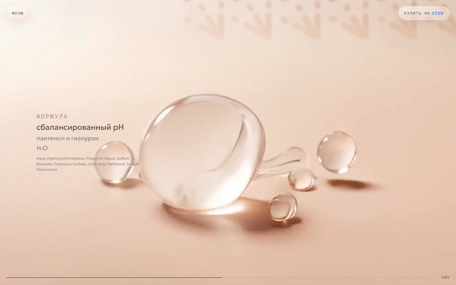
The Formula in Plain Sight
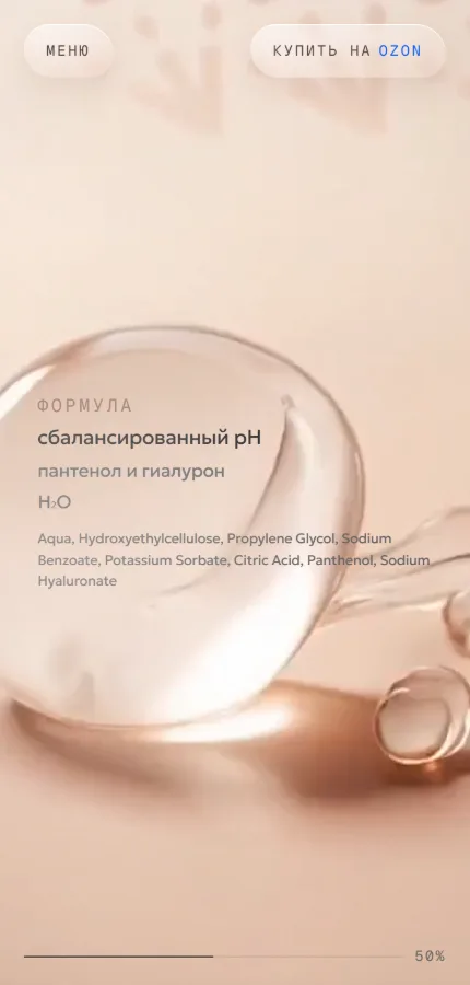
The formula is not buried in small print: balanced pH, panthenol and hyaluronate are set large, with the full INCI list beside them rather than behind a disclosure. In a category where the ingredients get read more carefully than the claims, that is the argument.
Two Variants and a Change of Light
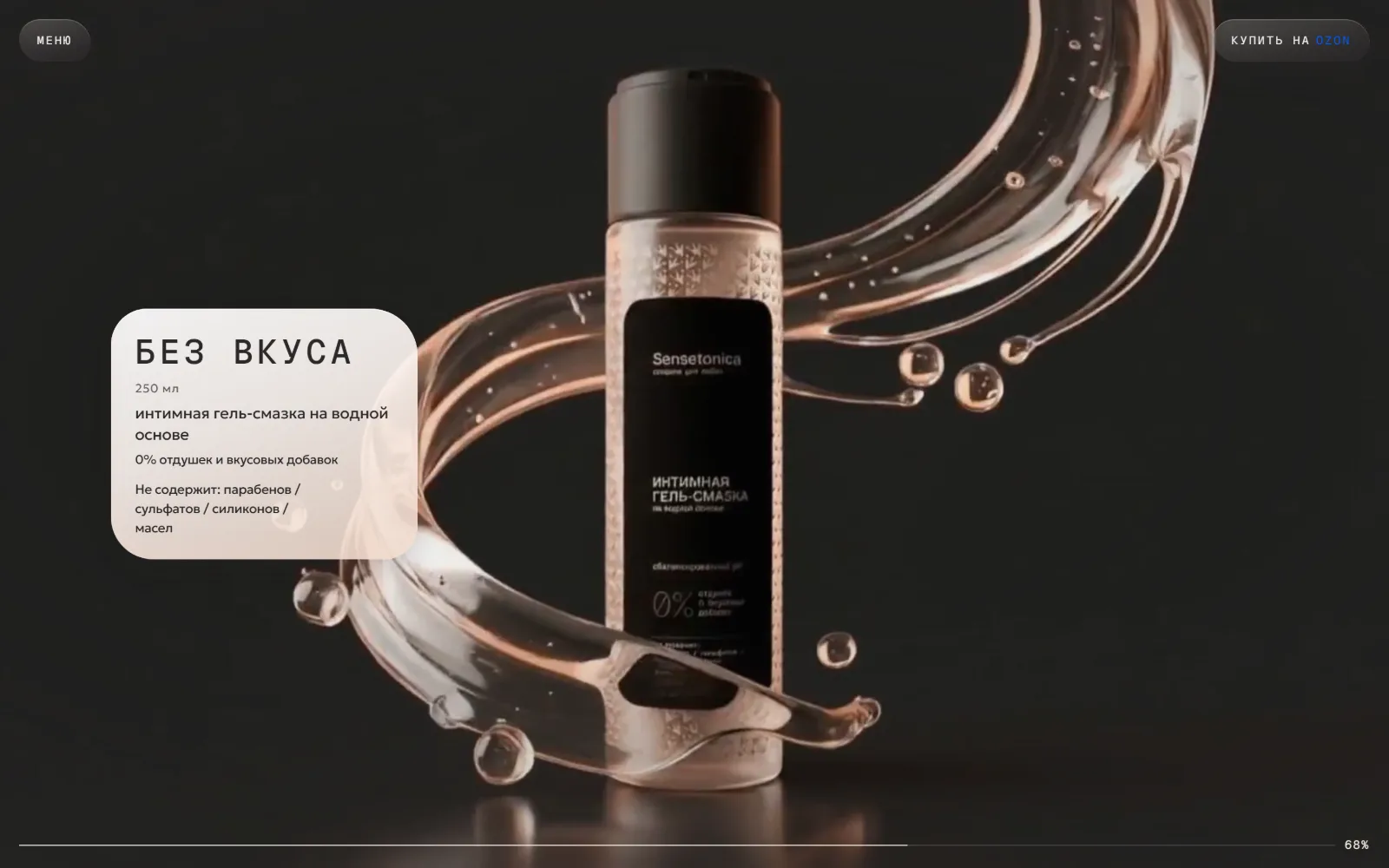
The choice between unscented and aloe vera is shown as two stretches of the scene rather than a comparison table: each has its own frame and its own card carrying the volume and what the formula leaves out. By this point the scene moves from cream light into darkness — the product stands out, and the shift separates the choice from the account of the formula.
Mobile
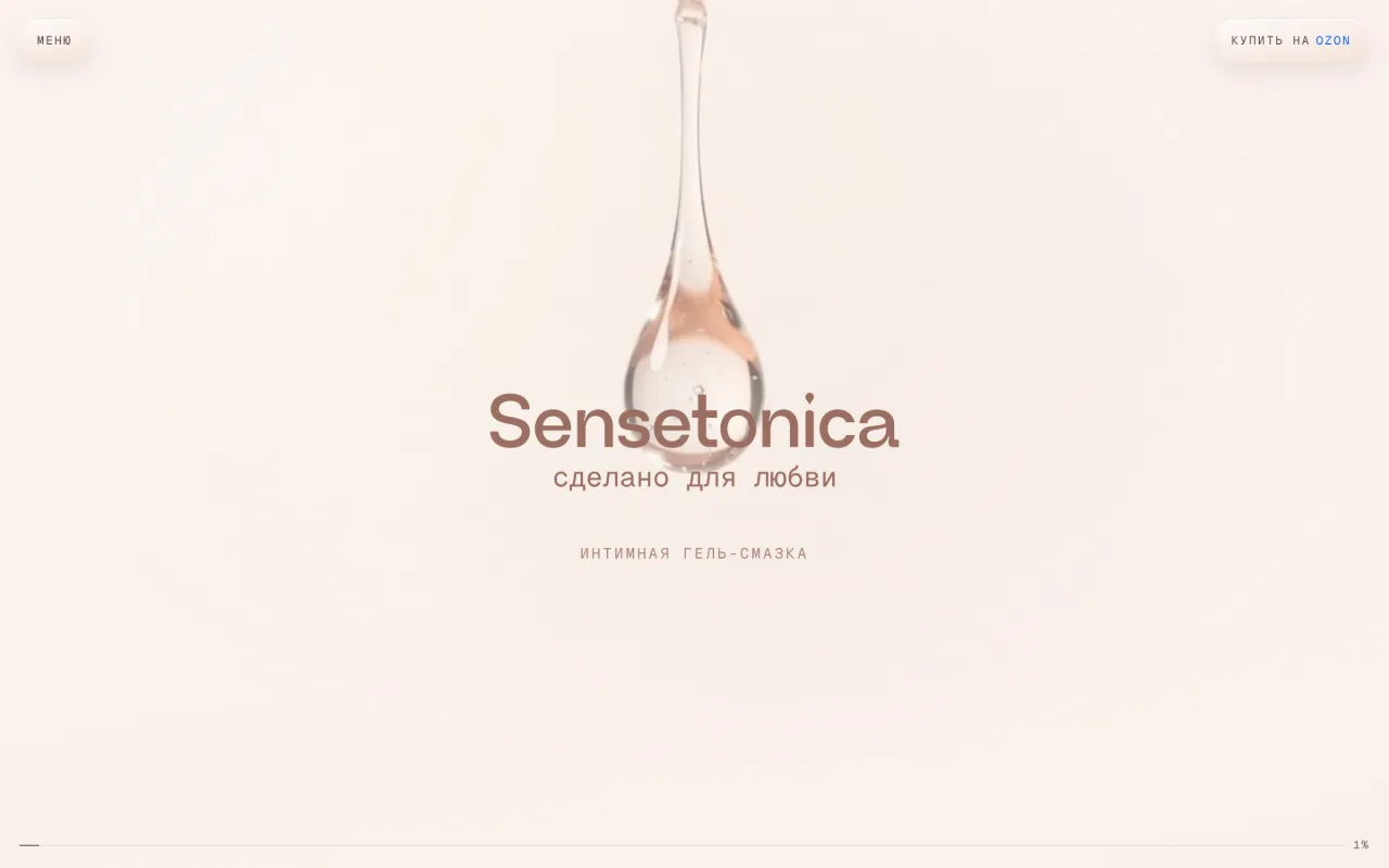
A phone runs the same scene, not a reduction of it: the frame is recomposed to vertical, text moves to the left edge, and the buy button stays in the header throughout. A finger drives the scene exactly as a wheel does on desktop.
Accessibility and Loading
The scene carries a text layer for anyone who will not see it: headings and descriptions live in the markup, a skip link works, and the menu holds anchors to the sections. The opening frame appears as a poster before the video is ready, and fonts and media load so the page never waits for all of them.
Бренд 18+: страница говорит о продукте и составе, без демонстрации.

Scope of Work
- Visual direction and typography for the site
- The script of a single scroll-driven scene
- Layers for the formula, the variants and the purchase
- Responsive desktop and mobile versions
- Text layer for the scene and anchor navigation
- Opening poster frame and deferred media loading
- Brand and product markup, launch
We do not publish client metrics or claim business outcomes. Every item listed here can be verified on the live website.
Services for a similar project
Have a project that needs a strong digital presence?
We reply within one business day.
Have more context? Complete the structured brief in 5–10 minutes.
Complete project brief